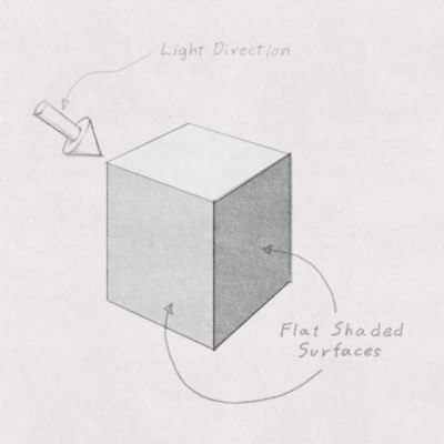
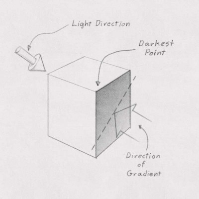
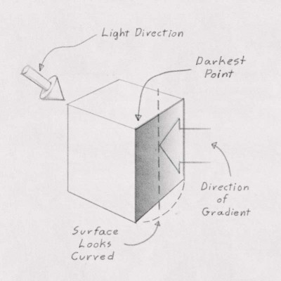
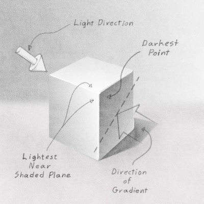
When rendering flat sided forms such as furniture or architecture it is helpful to have a clear idea of how to gradate the surface shading. If you leave the surfaces rendered in flat tones the feeling of light, atmosphere and form is hindered. Using gradations on flat surface can help but you need to be careful not to make the surface look curved. The general rule is to have the gradient travel diagonally across rectangular plane with the darkest corner toward the light. Avoid having the gradient be parallel or close to parallel to any of its edges. When a gradient is parallel to an edge the surface will look curved.
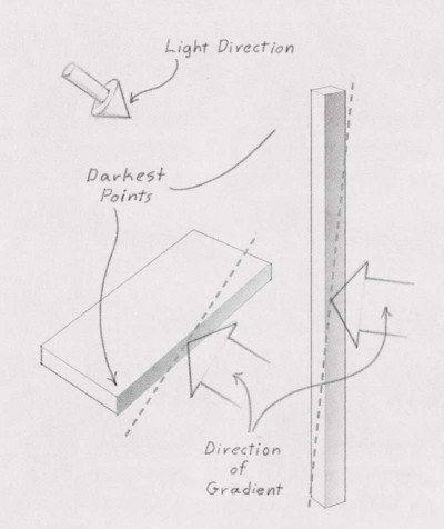
Long thin shaded planes as found in rendering table legs and the shaded edges of boards can be handled with this method as long as they are not too thin. This can really help to break long monotonous forms, focusing the viewers attention to the upper or forward ends.
The first areas to use the graded shading on are those that face away from the light, the planes in shade. The technique can also be used on the lighted planes but in this case the gradation is lightest where it meets the shaded plane. This will “force” the light at the front edges enhancing the illusion of light and by creating greater contrast help push the corner forward. Grading diagonally from the edges is also good to do here as well. If you render the background, cast shadows and occlusion shadows you can turn off the lines to see the full effect of rendering with gradations.
