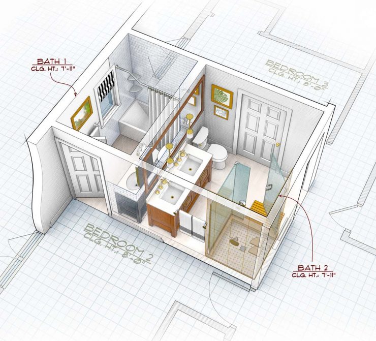
Interior Design Rendering for Fine Homebuilding Magazine with Multiple Layers of Transparency.
- Executive Art Director: Robert Goodfellow
- Deputy Art Director: Rodney Diaz
When I was given this interior design rendering assignment for Fine Homebuilding Magazine I realized there were only a few options to show how the two baths relate to each other. The first option is to view the baths from above in a flat plan view. I rejected this for obvious reasons, that it is static and boring, with little chance of grabbing the viewer’s attention. Another way to do it would be to cutaway the walls to show to show the interior. In this case I thought the cuts would take over the illustration pulling attention away from fixtures and interior objects that were the main focus of the story.
The Challenge of Multiple Layers of Transparency.
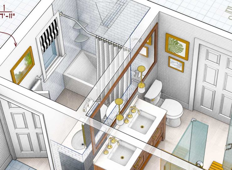
It’s one thing to see through a single wall, you can simply treat the wall as another picture plane. It’s a greater problem to design an image with multiple layers of transparency. In this bathroom remodel illustration I took on this challenge utilizing one, two and three levels of transparence. The greatest difficulty with multiple layers of transparence is to prevent the illustration from becoming unclear and descending into visual chaos. To prevent this great care needs to be used to design how objects overlap and to prevent confusing tangencies were the forms become unclear.
Digital Illustration Process for Interior Design Render with Multiple Layers of Transparency.
Determining the best angle to view the bathroom comes first. I created an accurate 3D model from the architect’s plans. After several attempts I determined the viewing angle that had the best chance working. Viewing through the longest wall made the most sense. This allowed for the front of the illustration to have a clear view the vanities for bothe baths.
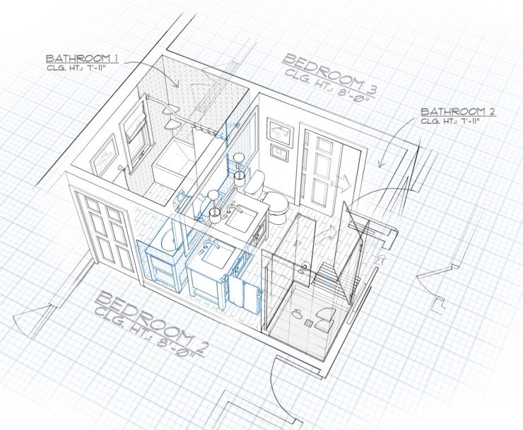
Next I developed a detailed line drawing. This helped me to see if the forms in the drawing would read well even with the transparencies. I used blue lines to show which areas would be transparent. It’s always essential to determine the validity of of your design in line form before rendering with color, light and tone. I have found that rendering can not rescue a drawing from poor design.
Going back and forth from hand drawing in Photoshop and moving and scaling the objects around in the 3D model I worked out how objects would relate to each other without creating accidental tangencies and confusing conjunctions. This took some time and effort but needed to be done before any rendering was started.
For this illustration multiple renders had to be carefully set up so they could be recombined in Photoshop to achieve the transparency effects. I find it best to start in the back and move forward. I rendered the smaller bath without the front wall and dividing wall. Next I rendered the front bath without the front and right walls. I rendered the back bathe’s back facing wall tiles and the shower wall tiles in line as a separate pass. I also made a pass for the blue print floor and another for the front wall. The renders were then layered in photoshop and the process of blending them together with masks began. Adjustments to color and tone were required to make the blends smooth and maintain the soft light I was using. Separate reflection layers were used for the large mirror as well as the reflective wall and floor tiles. This and other similar illustrations take extra effort but the challenge and the results make it worthwhile for this illustrator.


